Christopher Vidal Fine Art
  • Home
  • Paintings for Sale
    • Still Life
    • Landscapes
    • Plein Air Paintings
    • Cities
    • Portrait
    • Mastercopies
    • SOLD Paintings
  • The Artist
    • About my work
    • Curriculum Vitae
    • Galleries
    • Media/Publications
    • Exhibitions
  • Commissions
  • Tuition
    • Online Art Coaching
    • In person Art Consultations
    • Student Works
    • Workshops & Demos
  • Products
    • Photography
    • Placemats and Coasters
    • Other Products >
      • Licenced Photo DVD
      • Bargue Drawing Level 1
      • Bargue Drawing Level 2
  • Blog
  • Contact

Artist Christopher Vidal  - Blog

Welcome to my blog. The aim of this blog is to share with you some of my experiences related to my artworks, what inspires me and also how it is done. As an artist I am also constantly learning as this is an ongoing process. I also learn from my students when I am teaching in the class. Sharing what I know with others is also very satisfying. This is how we grow and improve. 
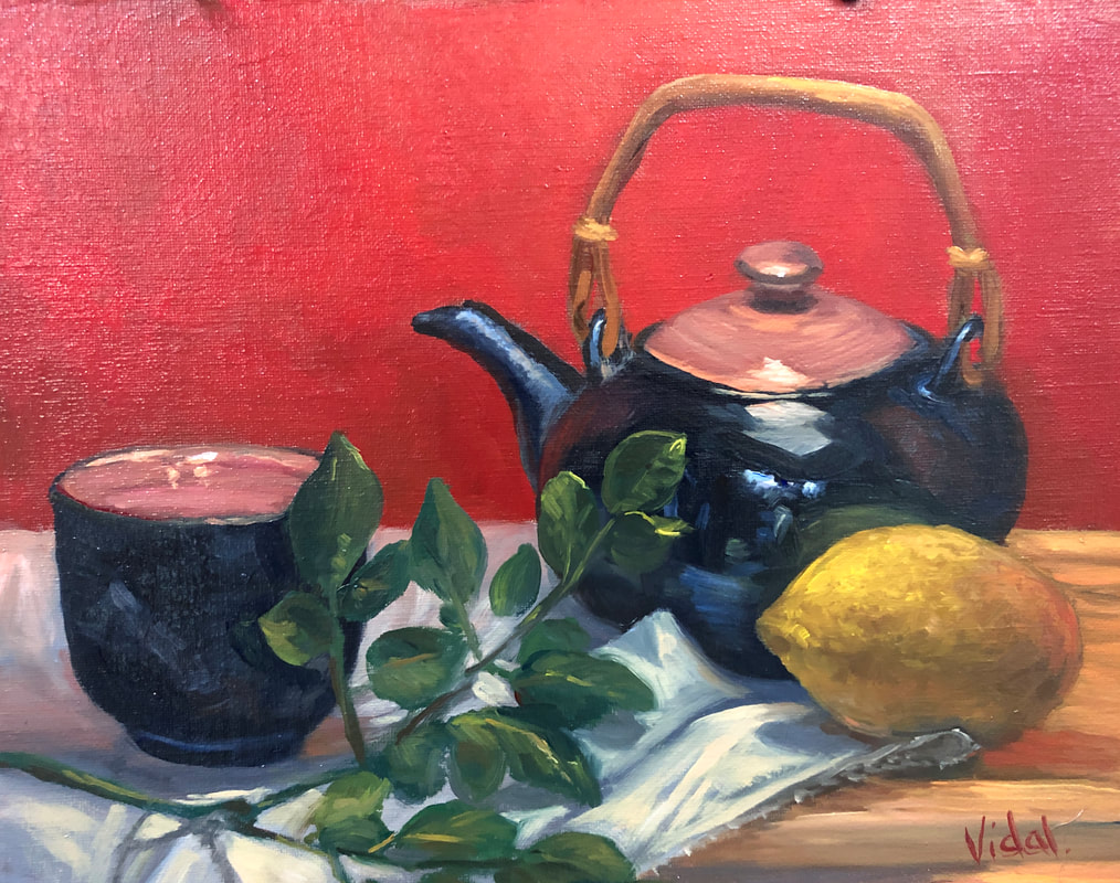
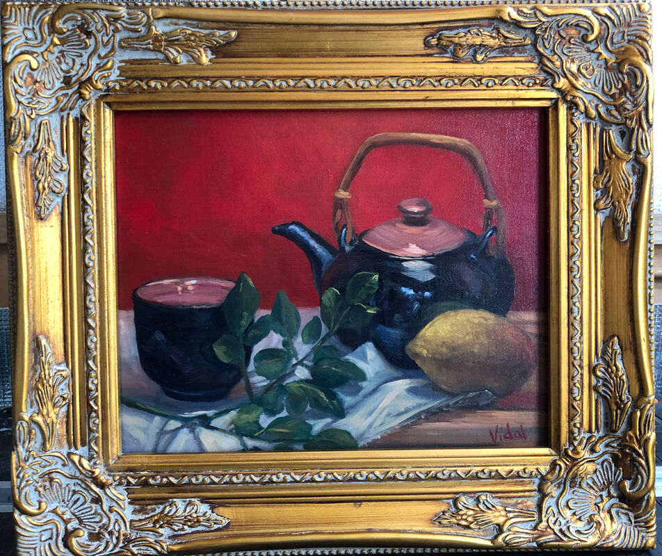
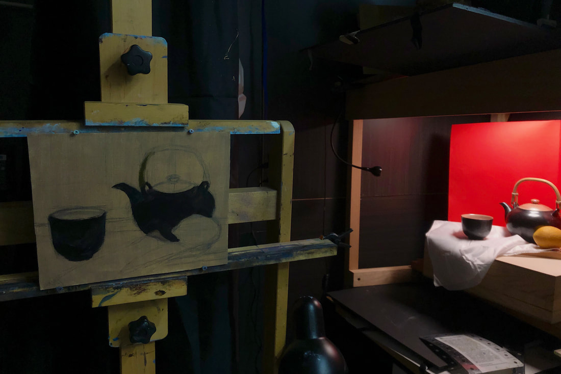
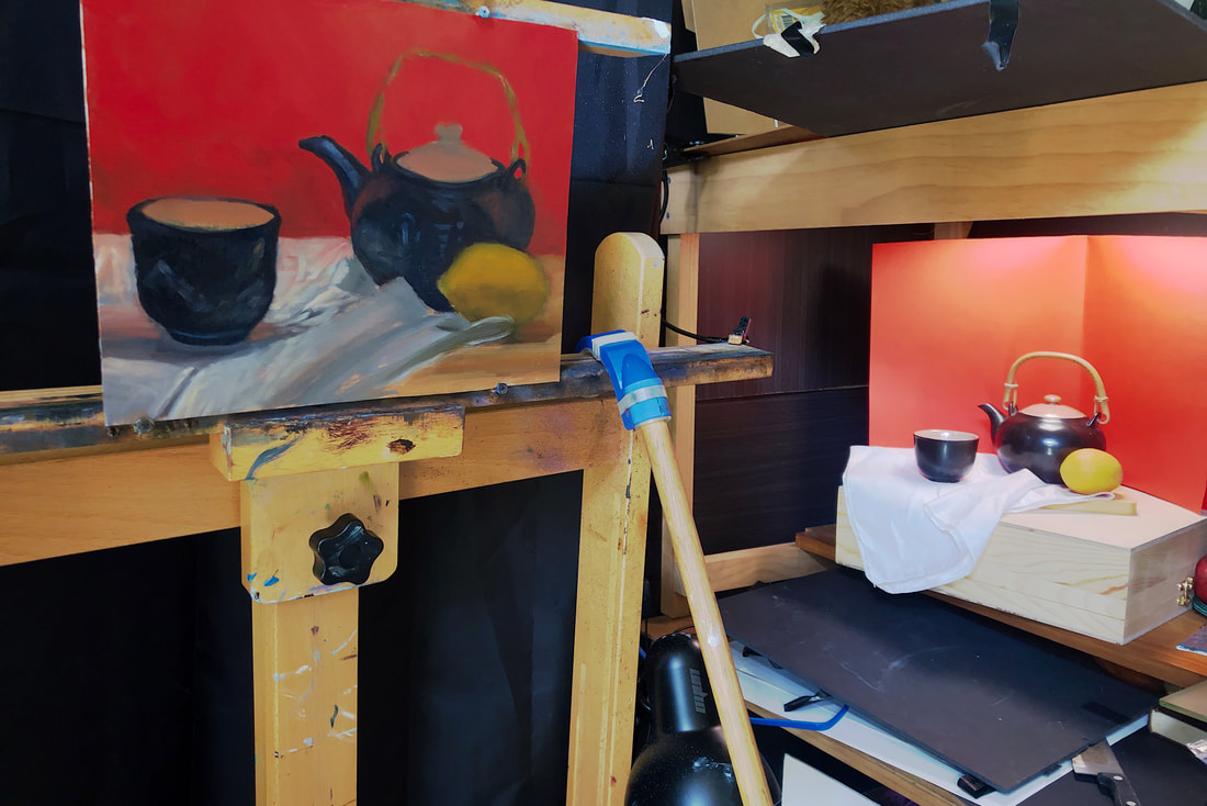
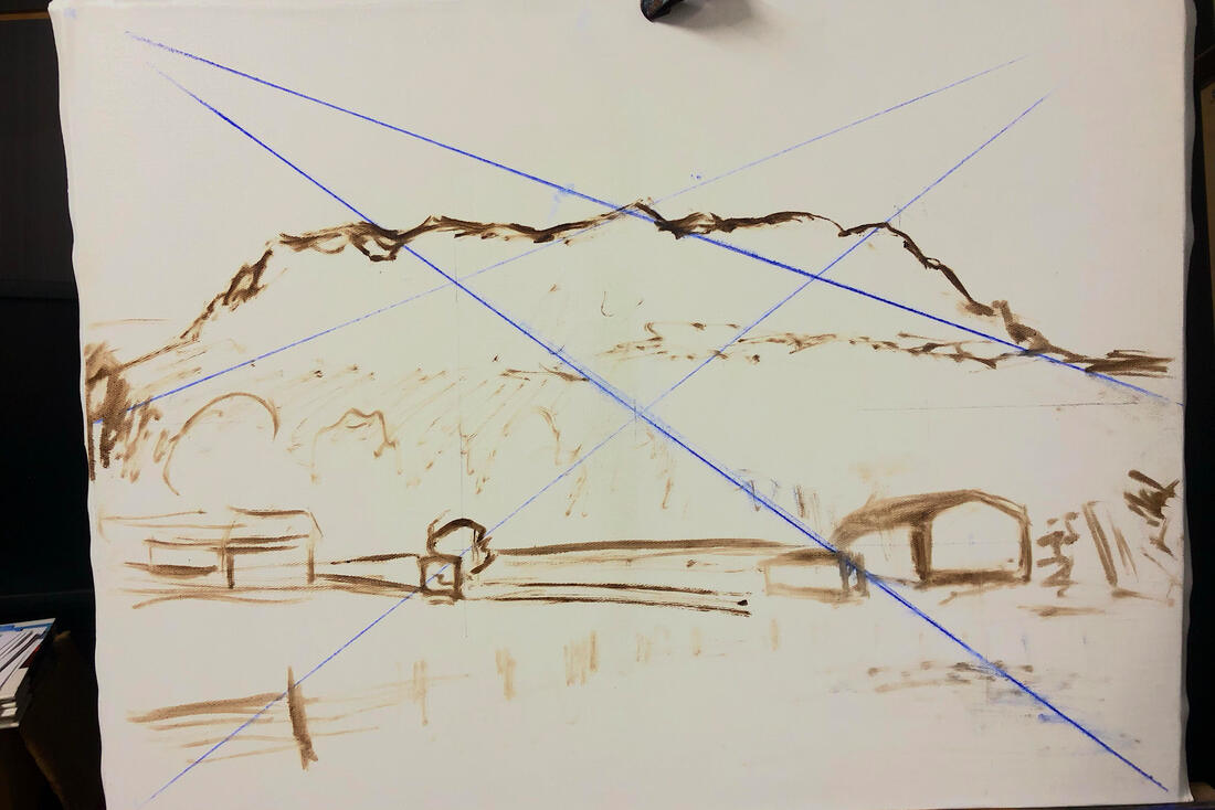
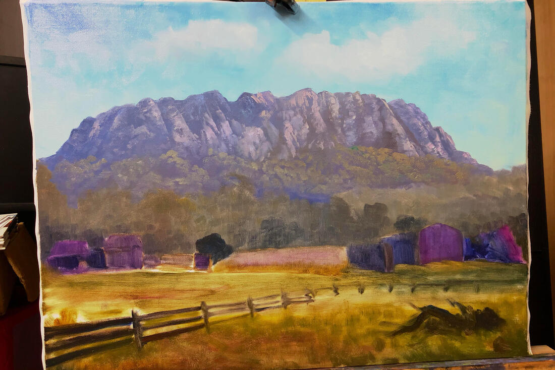
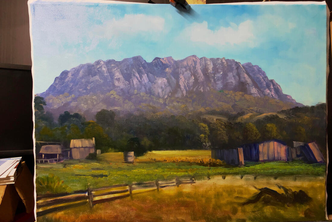
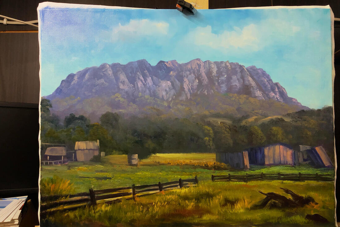
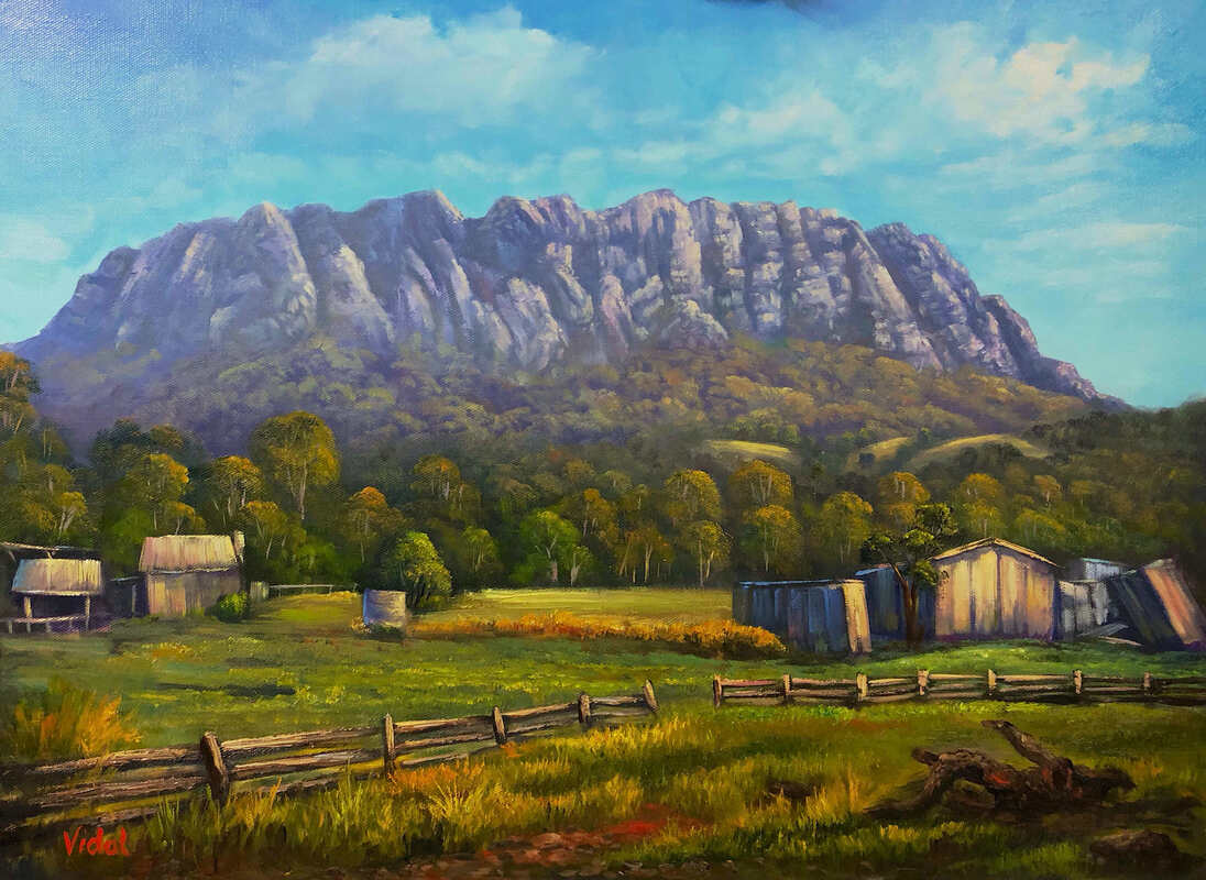
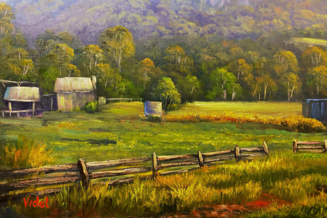
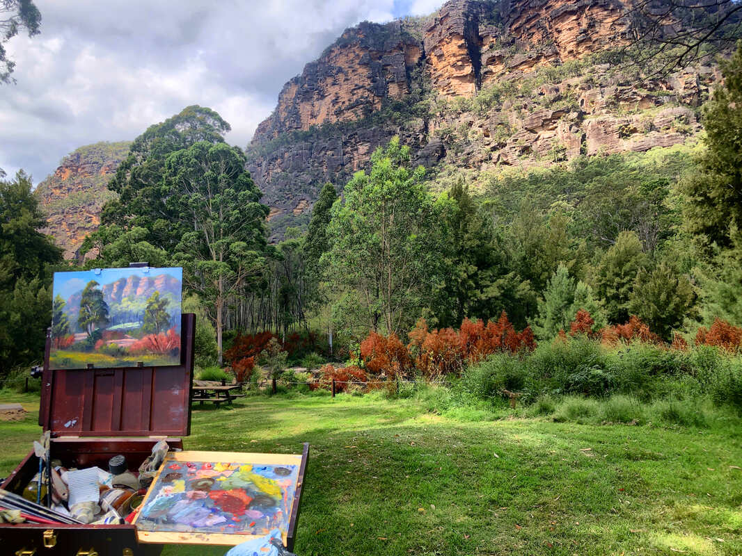
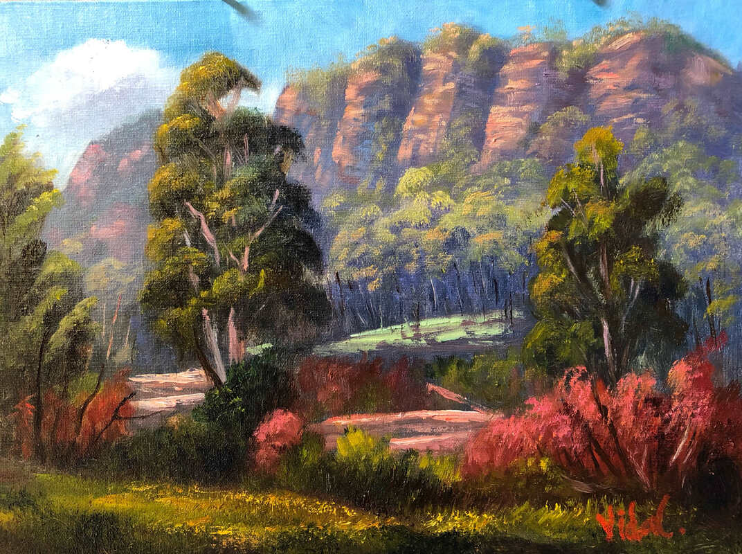
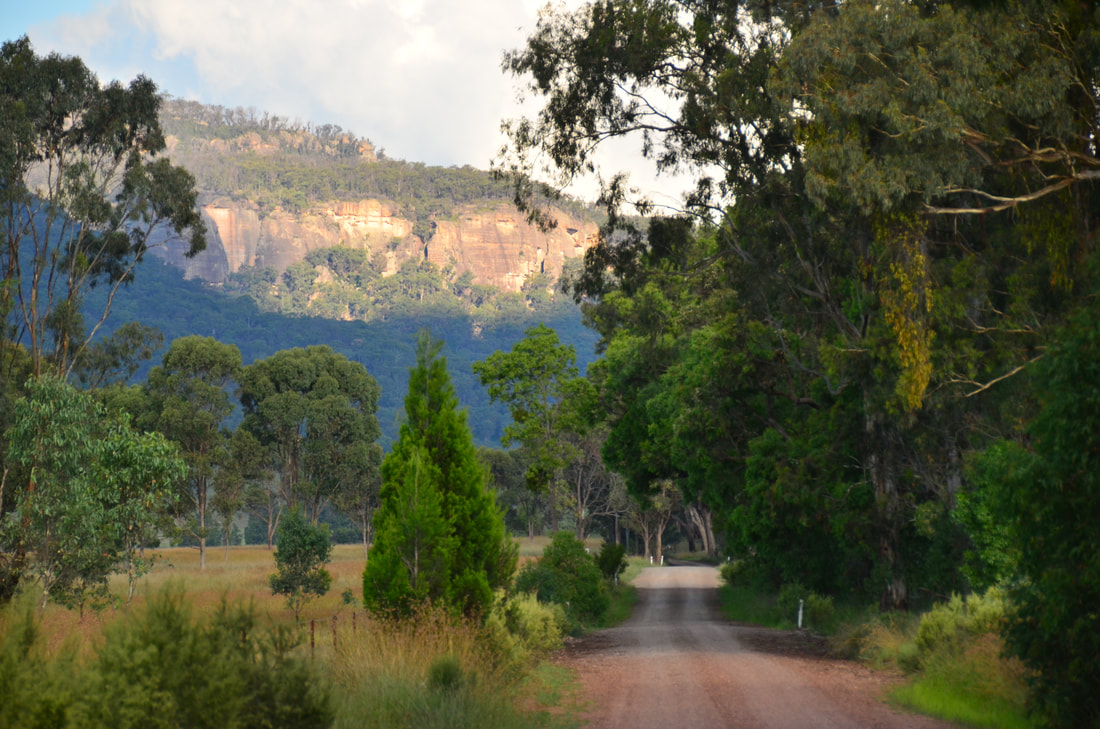
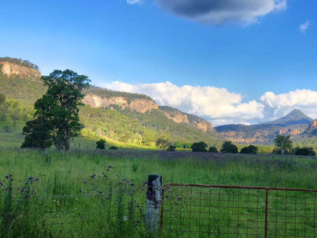
I've been teaching art for a while now, and I must say that from this I learned a lot. This helps me to identify what each individual needs in order to become a better painter. Painting is not an easy task especially landscape painting. One needs to have the inspiration to paint a tree or a mountain and it is not a question of just wanting to paint something. I choose to paint something because there was an element that motivated me to do so ...that inspired me. It could be the game of light and shadows or simply the warm colors of a late afternoon. It is sometimes very difficult to translate the colors that nature shows us using paint on a canvas. This challenge could be also a way to motivate you to paint a scenery. 
Most important is that you do not expect that every painting that you paint is going to be a masterpiece. You shouldn't be afraid that your final product is not what you expected in the first place. An unsuccessful painting should be the teaching ground for a better one that follows. This is how we learn. We learn from our own mistakes and from things that didn't work out as we wanted them but with an effort we try to make them better the next time. 
So if you want to become a better painter then you have to practice and paint regularly. This is the only way how you can improve your techniques, discover ones of your own, learn your colors etc. It is all about brush mileage. The tutor is there to help you find your way, shows you the basics and how to use your tools in order for you to be able to develop yourself. 
Looking forward to share with you my knowledge.

Preparing artist's paint

22/11/2020

0 Comments

 
Artist's paints used in painting consist of a pigment mixed (dispersed) in a vehicle, which in the case of oil paint, this vehicle is a vegetable drying oil such as linseed. The role of the vehicle is to adhere the pigment to the painting surface once dry forming a very strong but flexible layer of paint. 
Best vehicles in terms of strong adhesion are walnut and linseed oil. Drying times also vary between vehicles with linseed oil having the fastest drying time. 

Artist grade oil paints are the preferred kind of paints used by artists because they consists of real pigments and oil with minimal addition of stabilizers and dryers. Preparing own paint ensures that your paint only consists of the essential ingredients without any additives which can compromise the quality of the paint film. In this video I am showing how I prepared cobalt blue paint from raw pigment. The process took less than an hour to complete. Full details and information about materials are found in the video description on YouTube. Enjoy
​
0 Comments

Painting sand dunes and ocean

13/10/2020

0 Comments

 
The painting process of how to paint sand and ocean using oils. 

The approach is wet on wet and executed in three simple steps:
1. Drawing
2. Block in
3. Adding details and light
As a general rule when painting in oils, I always apply darker tones first followed by lighter ones as I move forward in the painting process.
The colour palette used was:
Flake white replacement (Gamblin)
Ultramarine Blue
Cobalt teal
Cadmium orange
Quinacridone magenta
Alizarin Claret (Michael Harding)
Cadmium yellow
Indian Yellow red shade (or Australian Red Gold)
Yellow ochre
Viridian
Burnt sienna

The images above shows:
1. The start up of the block in stage, where I painted the shadows. I used a lot of alizarin in the underpainting to help me avoid the problem of getting unwanted greens when adding the sand colour (yellow) with the shadow colour which consists of blue.
2. Second image shows the painting at the end of the block in stage. During the block in stage I establish the basic colour and tone of the various shapes and objects in the painting.
3. Third image shows the finished painting.
0 Comments

Still Life Fruit and Bay leaves

20/9/2020

0 Comments

 
Setting up a still life can sometimes be a daunting experience. Sometimes it takes me a few days until I find an appealing setup. Although there are guidelines re composition, however, I do not like to adhere to any specific rules. I just try to find the right combination of shapes, a balance between neutral and more chromatic colours especially complementary colours. Also the combination of materials is another factor including organic and natural materials in combination with man made objects. Then the last aspect I consider is the direction and colour of the light organised in a way to create interest, form and continuity through the cast shadows. Reflective and transparent objects are my favourite challenges. 

For this painting, a person gave me this interested fruit which looks like an apple in colour but having the shape of a pear. So I decided to place it on a piece of fabric along a reflective object. On top a piece of bay leaves from our yard to complement the fruit. The light was from the left and warm in colour.

I chose a small linen board primed with a non absorbent acrylic primer, I prepared some time ago. As a palette I just use the same limited palette of three primaries, titanium white and burnt umber to adjust the chroma. I drew a quick sketch with diluted burnt umber followed by a block in of the basic colours (Images 1 and 2). On the second session, I developed the form and details of each area starting from the darkest colours moving on to the lighter sections.  The finished painting is in the 3rd photo above.


0 Comments

Painting a still life

14/7/2020

0 Comments

 
0 Comments

Still life painting process - the narrative

4/7/2020

0 Comments

 
Painting a still life is much more than painting objects and similar to when painting other subjects it starts with the idea or inspiration. I usually start placing a number of objects into the shadow box, objects made up of different shapes and materials and of different sizes. I also keep in mind the choice of colour where usually I include neutrals, light and dark colours as well as some more vibrant ones. A painting is all about contrasts and light. It usually takes me a few days until I am happy with the setup and lighting. 

I also give importance to the narrative of the artwork since one of the most important aspects of true art is the message. This painting is about our life and existence on this planet represented by the globe. The books implies the importance of knowledge in our personal life and as well to humanity. The organic material of the feather also reminds us of the changes in our lives same as the bird changes feathers at different stages of its life. The blue book at the edge almost falling off the rest indicates the stress and our ups and downs while the hourglass symbolizes time. The candle in the symbolizes our life also reminding us of our mortality.

The painting was painted on oil primed linen using a limited palette consisting of ultramarine blue, pyrrole rubine, cadmium yellow light, burnt umber and titanium white. Additional colours used where cadmium red light, phthalo blue and Indian yellow.

The images above show the process, starting from the drawing, an imprimatura with raw umber followed by first underpainting and finished painting.

0 Comments

Oil Paint Drying Times

13/5/2020

0 Comments

 
One of the fundamental principles to keep in mind when painting in oils is the "Fat over lean" approach, that basically means the top layer of paint should dry at a slower rate than the lower layer. This can be achieved by either adding extra oil to paints used in the upper layers, which slows down the process of drying or simply by starting painting from dark to light. Some manufacturers add dryers to the paint preparation to make them dry pretty much at the same rate, however, these chemicals can compromise the quality of the paint in the long term. 

Here is some info about various commonly used pigments and their drying times. Mixing a slow drying pigment with a fast-drying pigment might alter the drying time depending on their proportions. One should always try to start with fast drying and relatively transparent pigments moving on to slow drying and more opaque paints. In the table below I am also giving the pigment number eg: PW1  meaning Pigment white 1

Reading the label at the back of the tube is important as most of this information is given there. The table below is a guideline and there might be some differences between manufacturers as they might be using different pigments under the same colour name and also due to using different oils in the tube. Avoid buying paints that are in safflower oil. Linseed or walnut oil is the best. One also has to remember that oil paints do not dry by evaporation as watercolour and acrylics do. So the thickness of the paint affects the curing, with thick paint taking longer to dry. Ambient temperature might also affect, in hot weather drying happens much faster, however, never attempt to dry your paintings using heat. Do not forget that oil paint dries by reacting with oxygen in air and not by evaporation. If the paint is touch dry it does not mean that it is completely cured. So it is important to apply thin layers of paint at first moving on to thicker and more oily paint as you progress. 

Fast drying   (1 - 2 days)
Lead whites       PW1      Transparent 
Raw and Burnt Umber  PBr6      semi-transparent   (Very fast drying)
Raw and Burnt Sienna  PBr7      semi-transparent
Phthalo Blue    PB15.3    Transparent
Phthalo Green  PG7         Transparent   (Very Fast)
Viridian    PG18  semi-opaque (very fast)
Cobalt Blue  PB28     semi-opaque    (Very fast)

Average drying time (2 - 5 days)
Yellow ochre  PY43 and Yellow oxide (sometimes sold as yellow ochre) PY42    semi transparent
Cerulean Blue  PB35     semi-opaque
Ultramarine blue  PB29   Transparent
Cobalt teal  PG50  Semi-transparent
Quinacridone magenta  PR122   Transparent
Cadmium red light  PR108   Opaque
Ivory black (Bone black) PBk9   Opaque

Slow drying (5 - 7 days)
Alizarin Crimson  PR83   Transparent
Titanium white  PW6    Opaque
Cadmium Yellow  PY35  Opaque to semi-transparent
0 Comments

Painting light

17/4/2020

0 Comments

 
A full oil painting demonstration, showing how to paint a typical Blue Mountains landscape, focusing on establishing the light effect on cliff walls. 

​
0 Comments

Painting distant trees and cows

10/4/2020

0 Comments

 
0 Comments

Painting Demonstration - Waves in Oils

16/1/2020

0 Comments

 
0 Comments

Outback landscape painting process

13/1/2020

0 Comments

 
The whole process of painting this artwork was spread over 3 sessions. Probably in the coming days there will be some more finishing touches by pushing more the light in a few areas to create more form. It is always good to have a look at the painting on a different day and with a fresh eye to make decisions about adjustments.

The first session was quite quick and the focus was on drawing the major shapes and establishing a tonal painting. Colours used were cobalt blue, cobalt teal, burnt sienna, cremnitz white mixed with titanium, quinacridone magenta and viridian. I applied the paint very thinly on the canvas using an odourless solvent when ever I needed to thin the paint and facilitate brushing (Image 1 first from left). Most of the paints used for the underpainting are transparent and dry very quickly. Two important things I always keep in my mind when painting is the direction of the light and positioning of light and shadow within the painting. The underpainting colour is the complement of the colour I am going to place over it in the next stage and a little bit warmer (redder) where I am planning to place the light.
Images 2 - 4 Session 2. This stage is more labour intensive as one needs to start creating form adjusting what was done in the first session but trying to stick withing the tonal range in each section of the painting. I usually start from the sky and moving from background towards the foreground.The paints this time were a little bit more opaque, so I introduced titanium white for my tints and other colours such as yellow ochre, cadmium scarlet, Cerulean blue, Venetian red and Indian yellow (red shade). I was using most of my paints directly from the tube or if needed using a 25% cold pressed linseed (in odourless solvent). As brushes I was using a combination of medium sized flats, filberts, daggers, riggers and rounds plus palette knife which is very useful to apply thick paint .​

In session 3 (last image) I continued to add more detail working slightly more on the sky and clouds plus foreground. During this stage I introduced more paints mainly phthalo green, burnt umber, lemon yellow (Michael Harding) and cadmium lemon light. As medium I was using 50% stand linseed oil to slow down the drying time. Staring from dark to light, I established the foreground rocks, stones and vegetation, again constantly adjusting light and shadow to create form.
0 Comments
<<Previous
Forward>>

    Author

    As an artist I want to share with you my experiences and what is behind my artwork. Every artwork is an expression of the inner self. It is driven by experience. 

    Archives

    June 2022
    May 2022
    November 2021
    April 2021
    March 2021
    February 2021
    December 2020
    November 2020
    October 2020
    September 2020
    July 2020
    May 2020
    April 2020
    January 2020
    December 2019
    November 2019
    October 2019
    June 2019
    April 2019
    March 2019
    February 2019
    December 2018
    November 2018
    October 2018
    September 2018
    July 2018
    May 2018
    March 2018
    February 2018
    January 2018
    December 2017
    November 2017
    September 2017
    July 2017
    June 2017
    May 2017
    February 2017
    January 2017
    December 2016
    November 2016

    Categories

    All

    RSS Feed

Copyright 2021 christopher vidal.com.au
ABN: 99673806422
  • Home
  • Paintings for Sale
    • Still Life
    • Landscapes
    • Plein Air Paintings
    • Cities
    • Portrait
    • Mastercopies
    • SOLD Paintings
  • The Artist
    • About my work
    • Curriculum Vitae
    • Galleries
    • Media/Publications
    • Exhibitions
  • Commissions
  • Tuition
    • Online Art Coaching
    • In person Art Consultations
    • Student Works
    • Workshops & Demos
  • Products
    • Photography
    • Placemats and Coasters
    • Other Products >
      • Licenced Photo DVD
      • Bargue Drawing Level 1
      • Bargue Drawing Level 2
  • Blog
  • Contact